Butler Senior High School History Wall
As a 100+ year-old school district, Butler partnered with IKM Architecture on a major addition and renovation of their senior high school campus. The superintendent wanted the school’s rich history represented in a fresh, engaging way through a dedicated history wall as part of the new design.
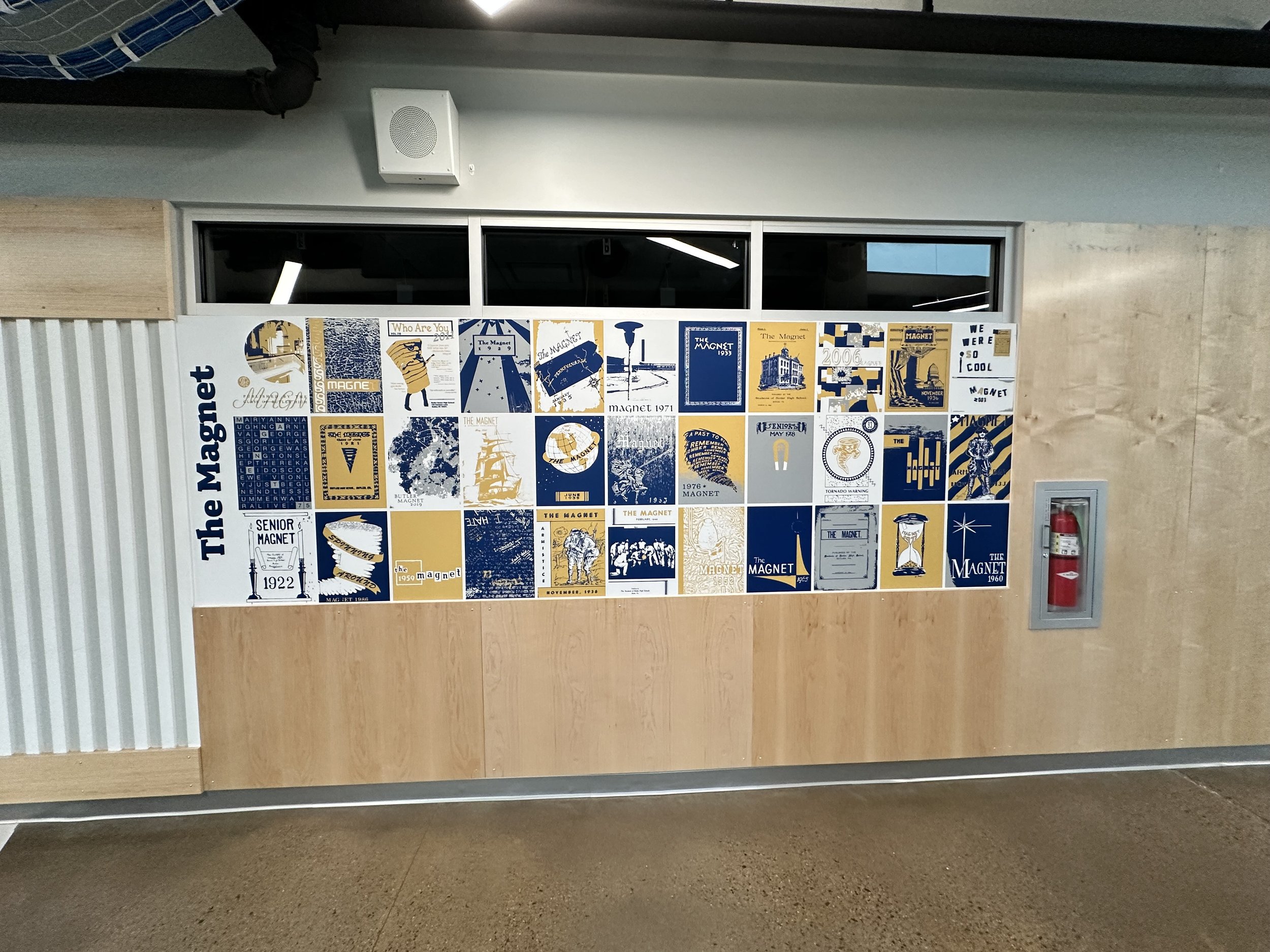
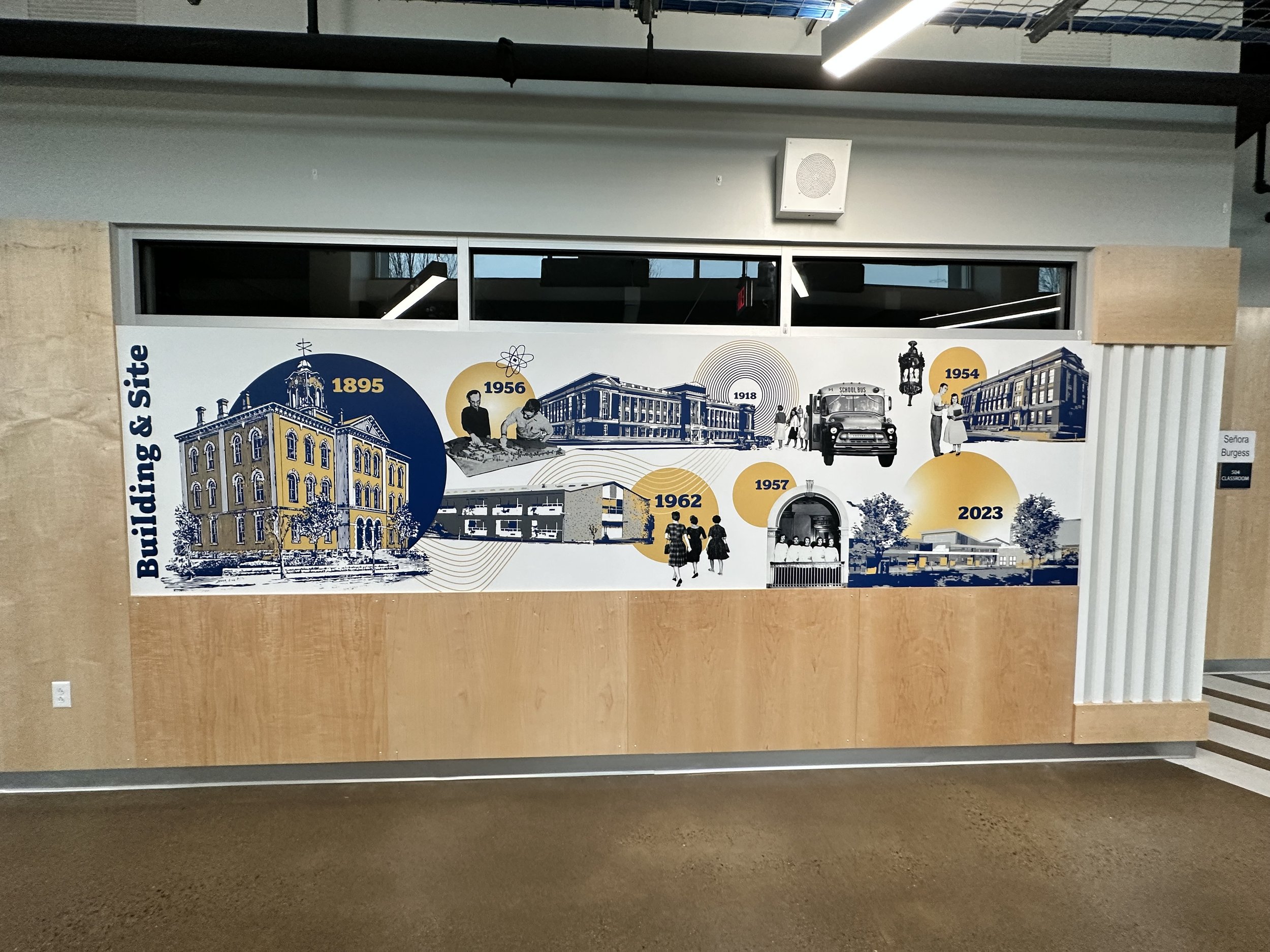
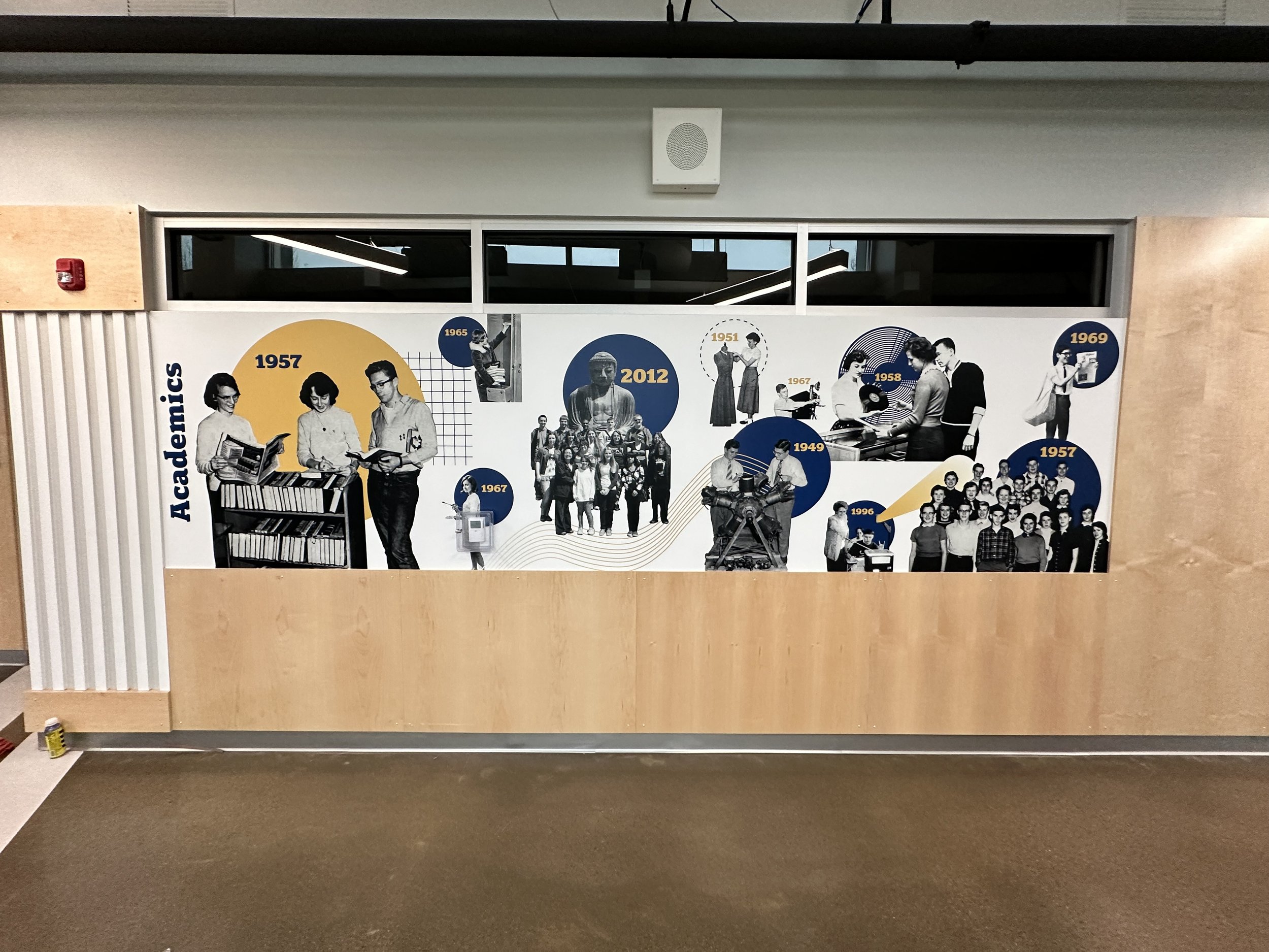
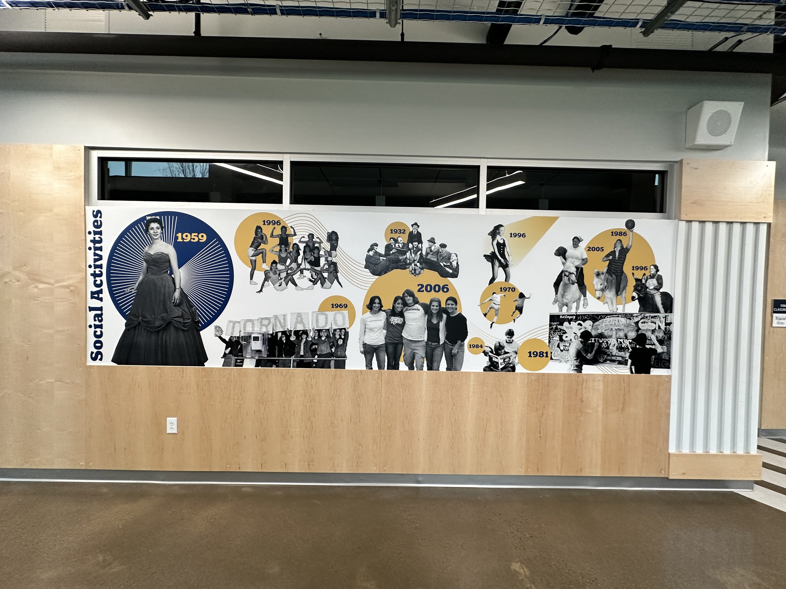
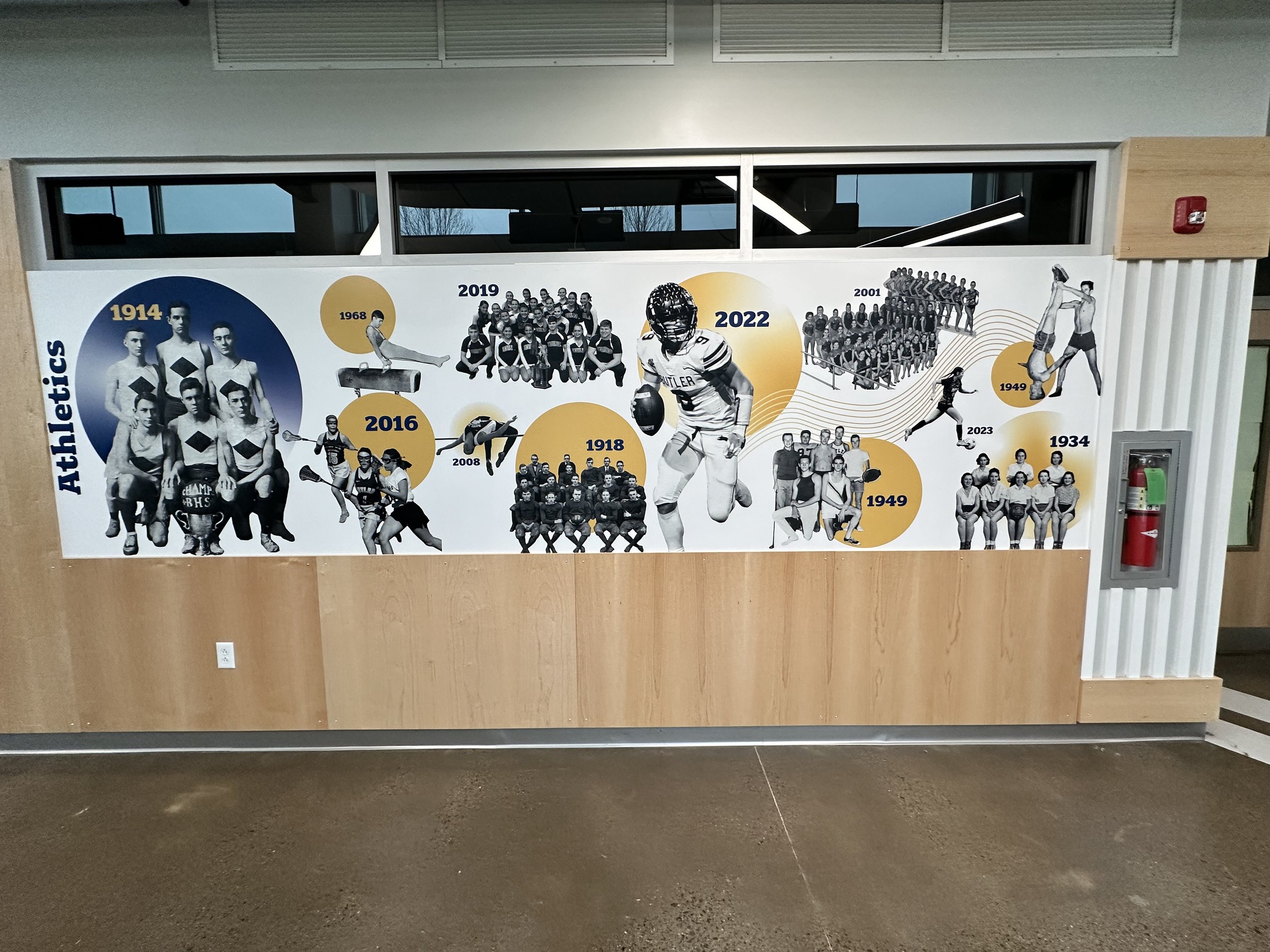
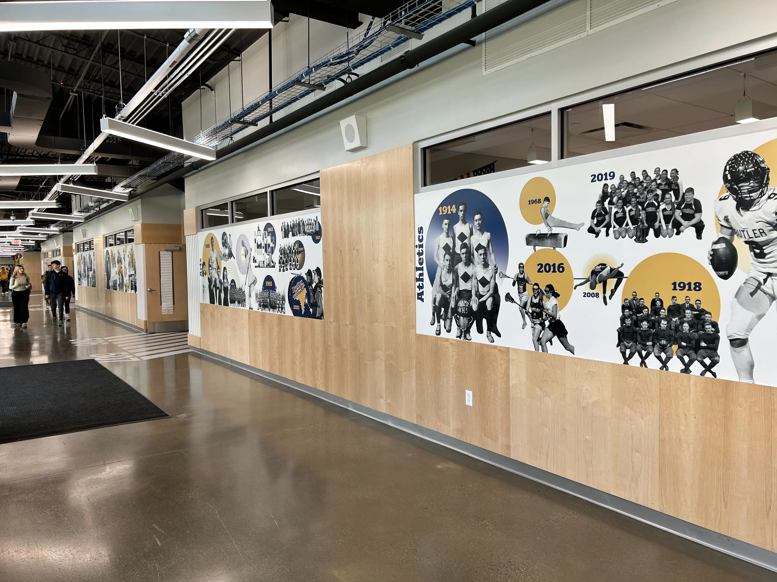
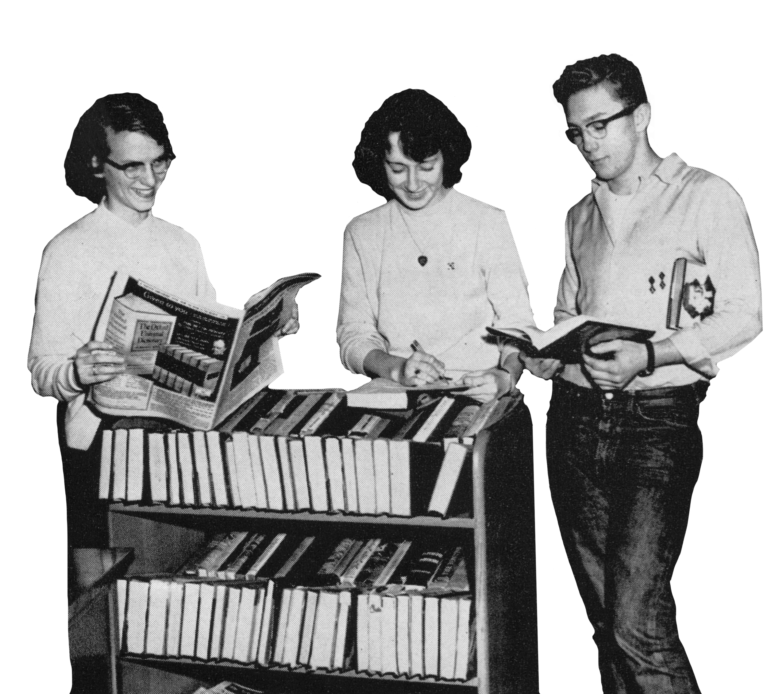
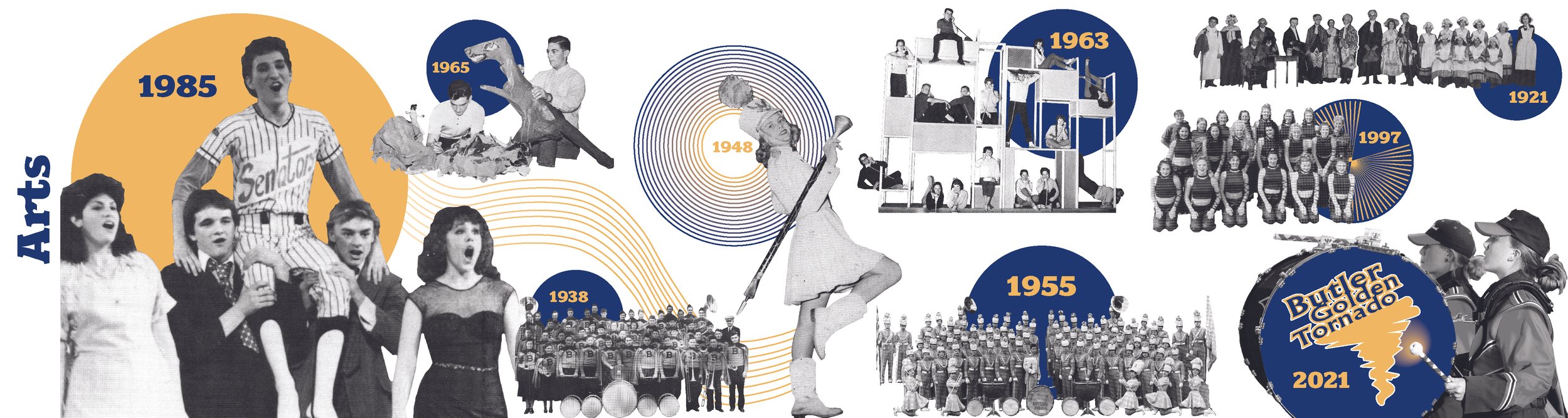
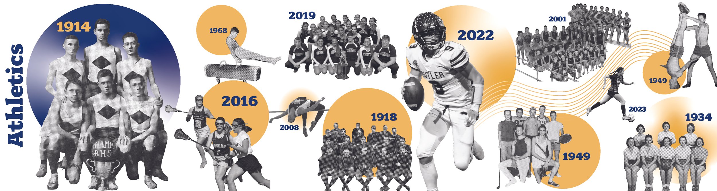
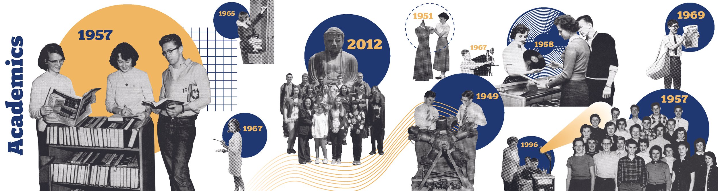
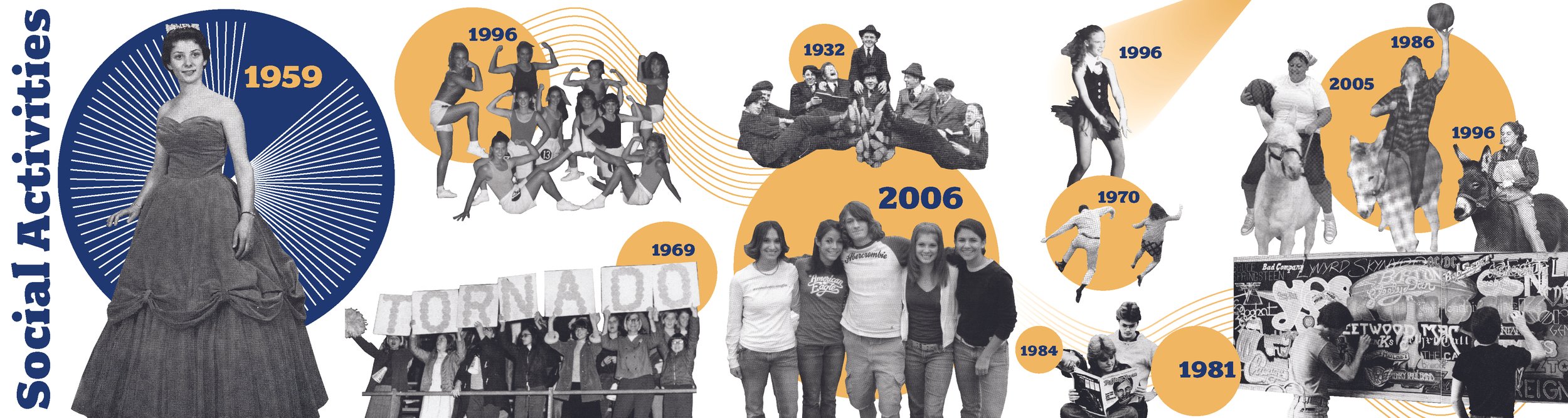
The project involved multiple meetings with the superintendent to clarify goals, assembling a team of current students for a user engagement session, and selecting photographs from over a century of yearbooks for high-resolution scanning. The final design features a 100+ foot-long wall organized into themes: arts, academics, athletics, student life, building and site, and a section highlighting the school’s iconic yearbook covers, The Magnet.
Rather than presenting history in a strictly chronological format, the wall uses a non-linear layout—creating a sense of timelessness and continuity instead of ending abruptly in 2023.
Scope
Stakeholder Engagement
Creative Direction
Art Direction
Visual Design
Print Vendor and Install Coordination
Team
Matt Hansen, Principal in Charge
Adam Yaracs, Project Manager
Lauren Vrbin, Interior Designer
Signorama, Print / Install Vendor

Yearbook Photo Selection
I led a stakeholder engagement session with the Superintendent and select students from Butler High School to review over a century’s worth of yearbooks and archives in order to select photos for the history wall. The Superintendent emphasized the importance of student involvement and wanted them to feel ownership over the project.
Using color-coded sticky notes, students identified images that aligned with the six designated history wall panel categories. The selected yearbooks were then sent to a local print vendor, who provided high-resolution scans of all the marked pages.


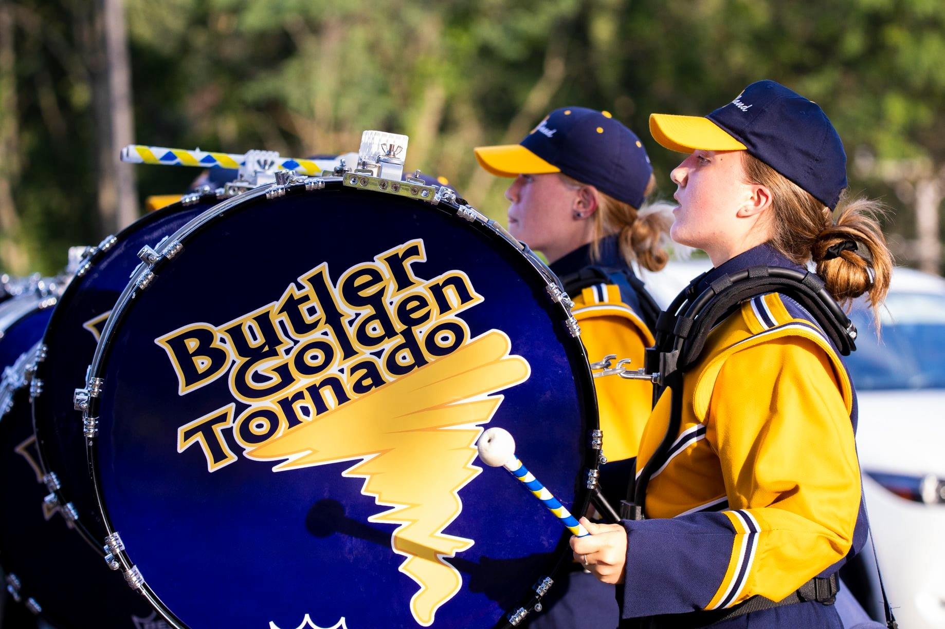
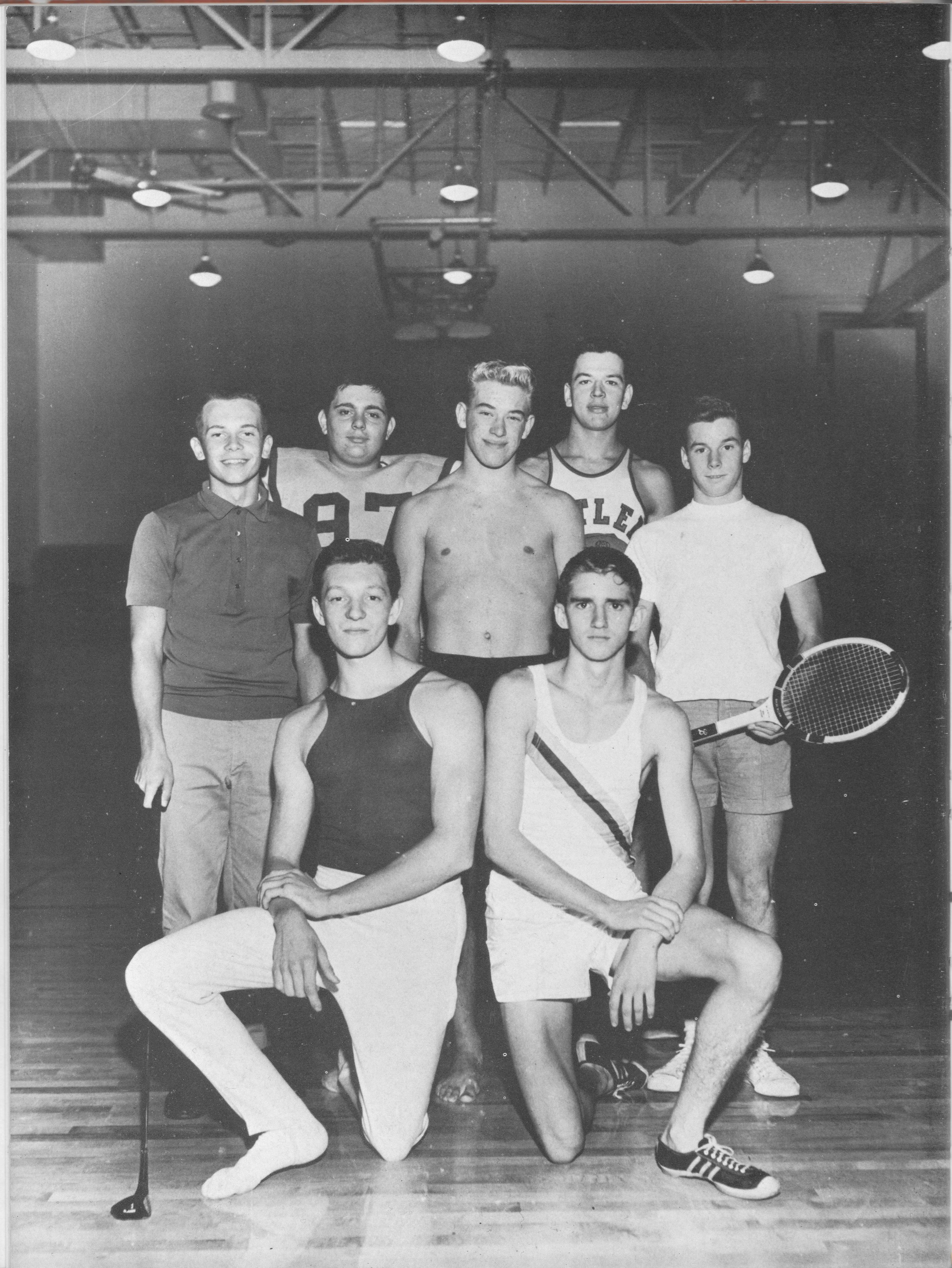
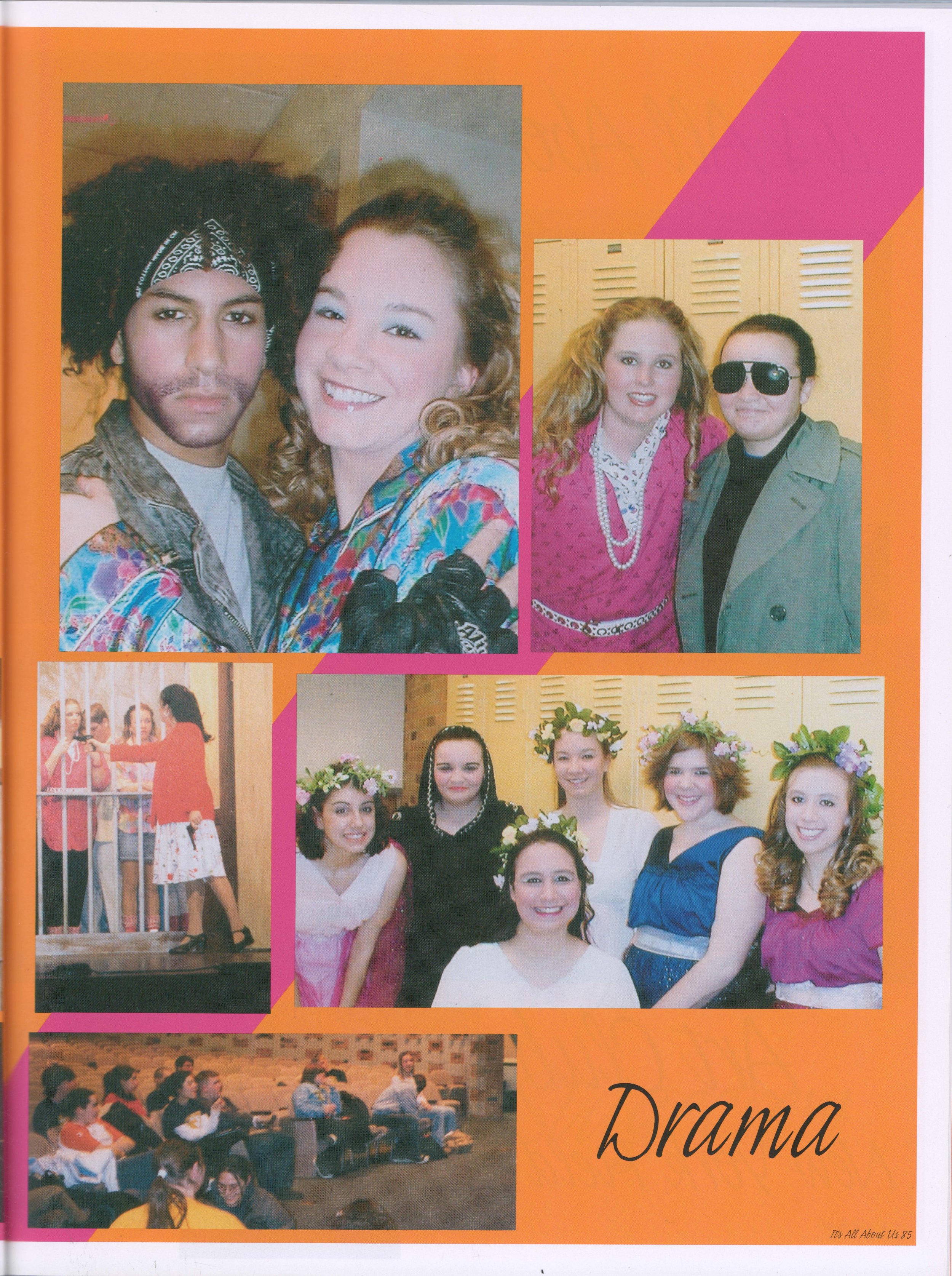

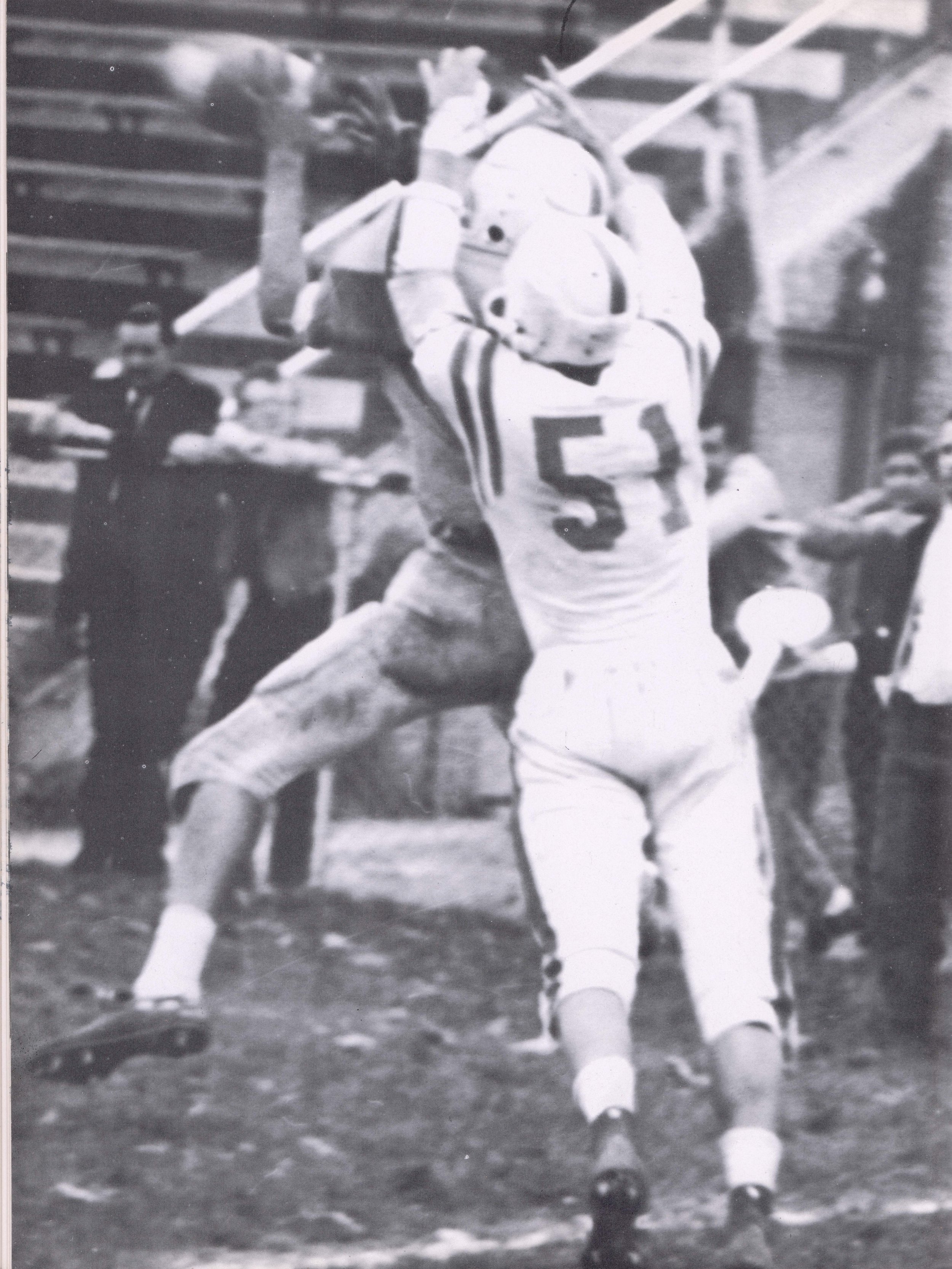
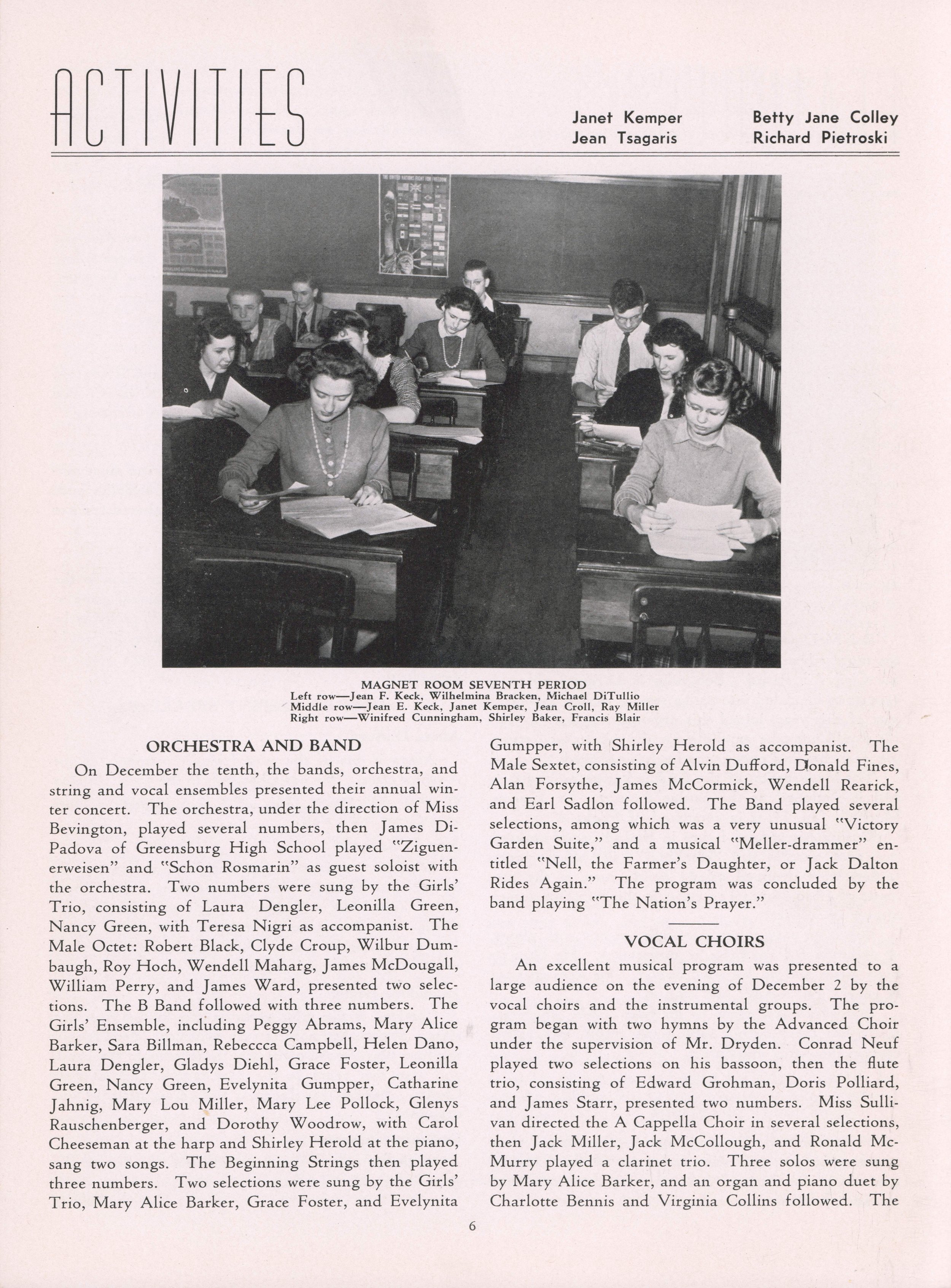
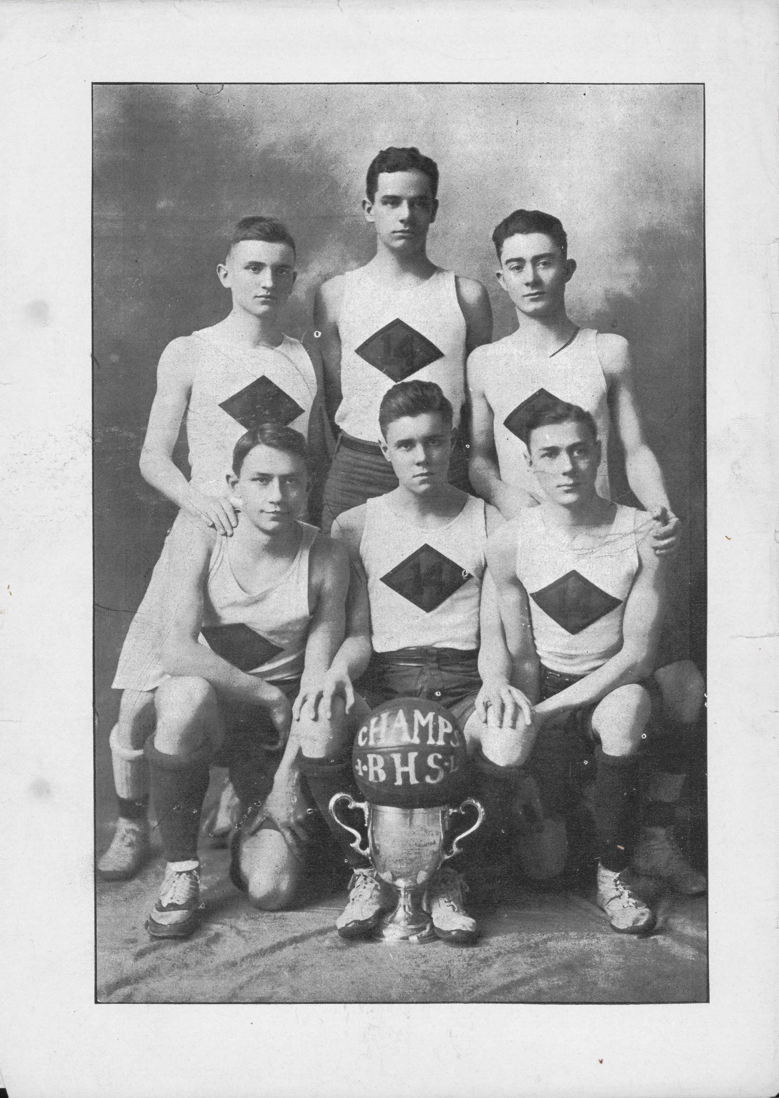
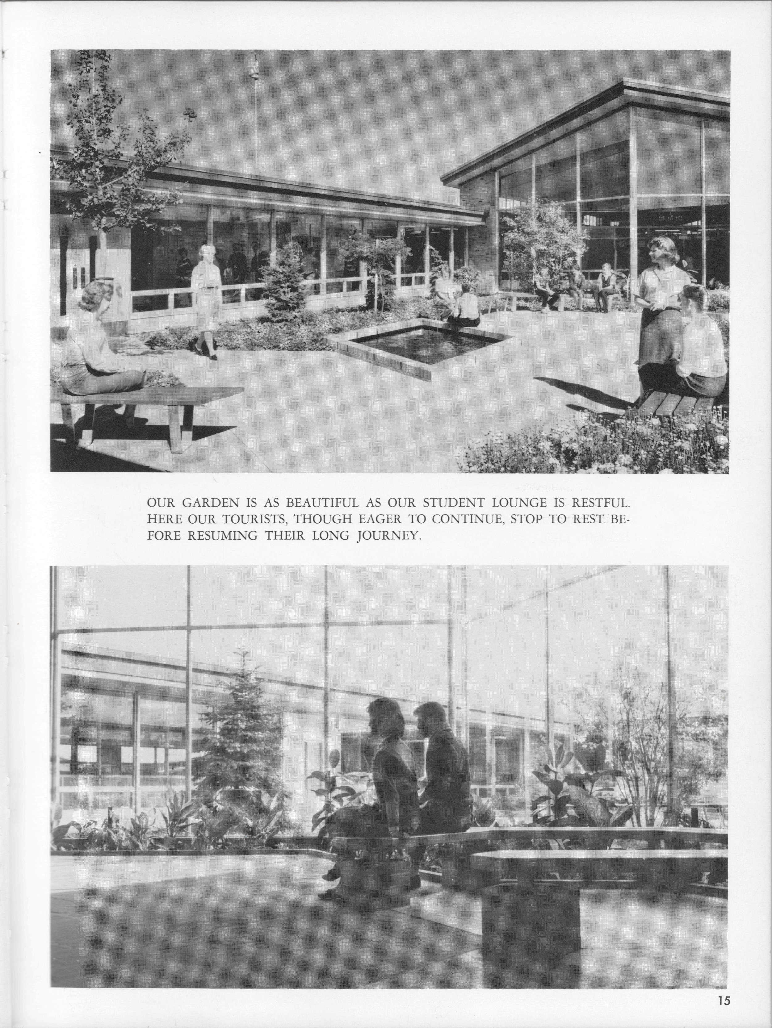
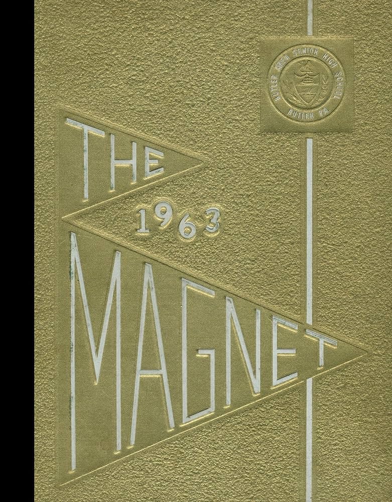
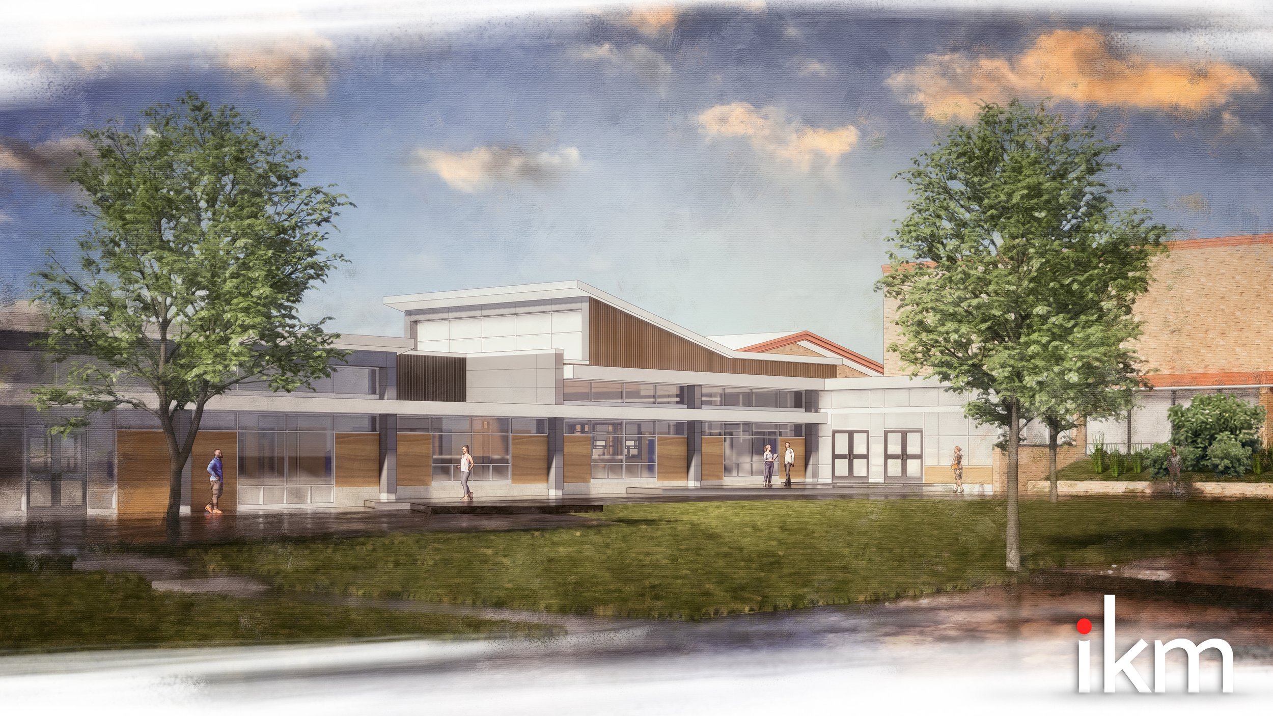
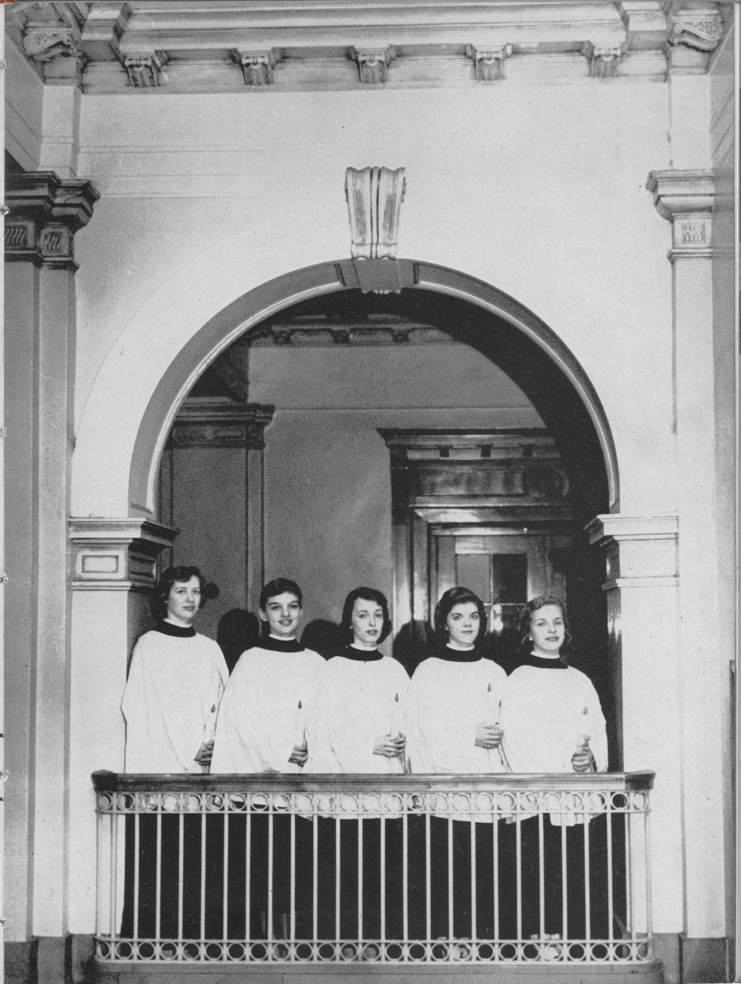
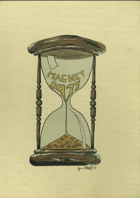
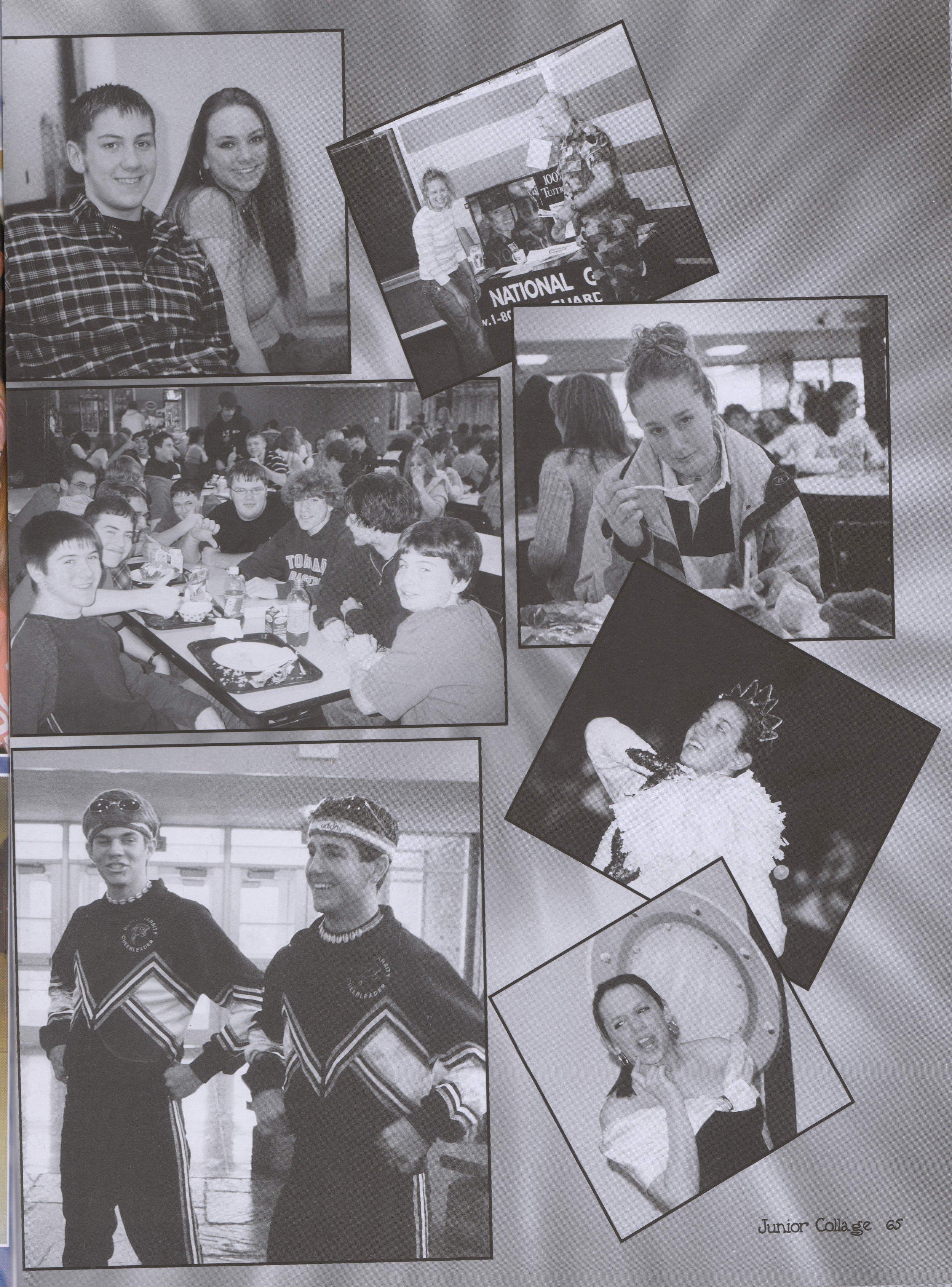
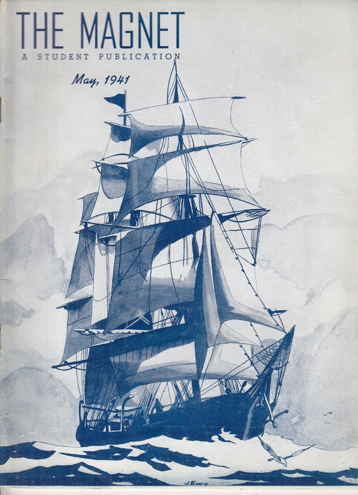
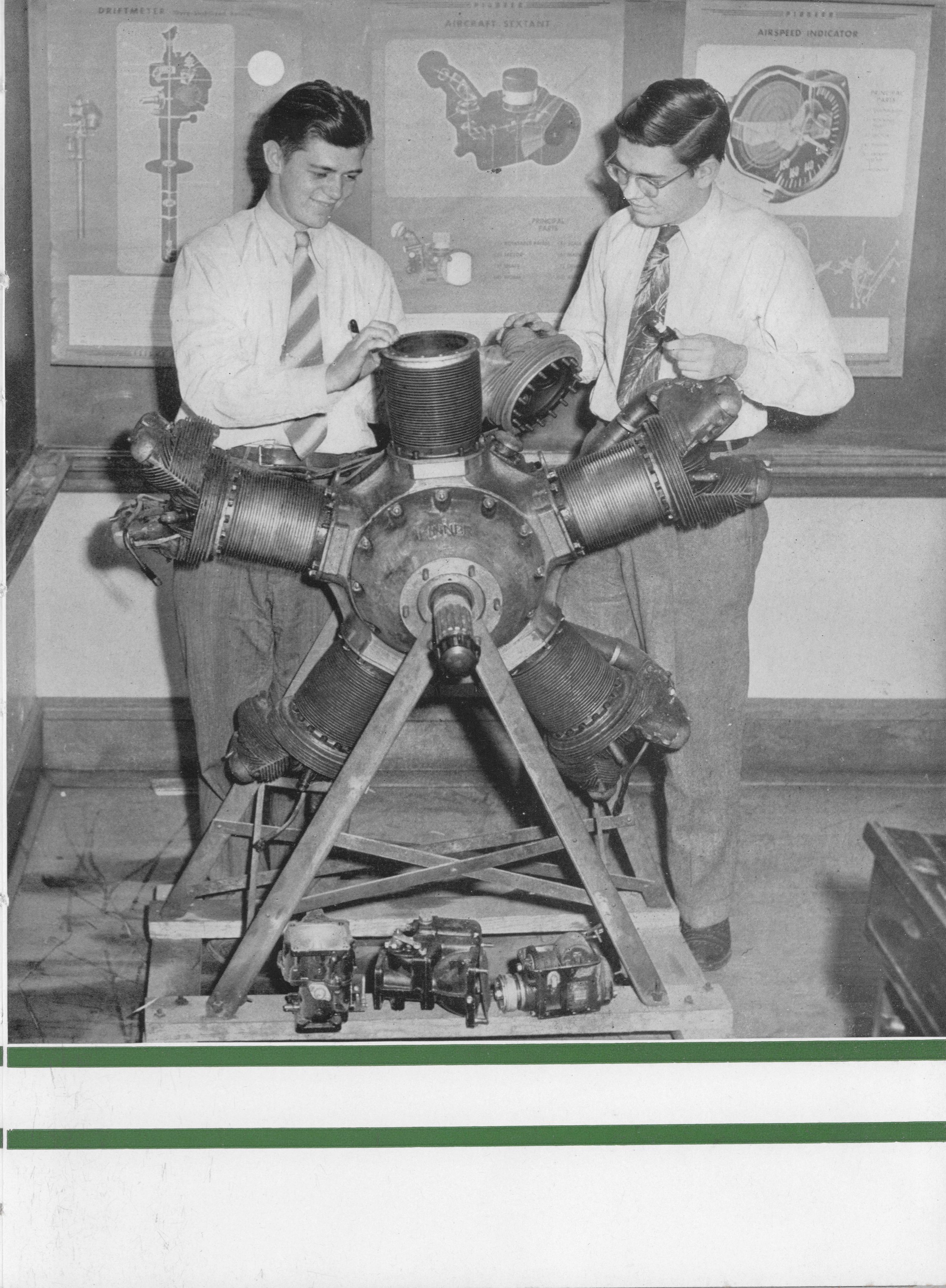

Image Preparation
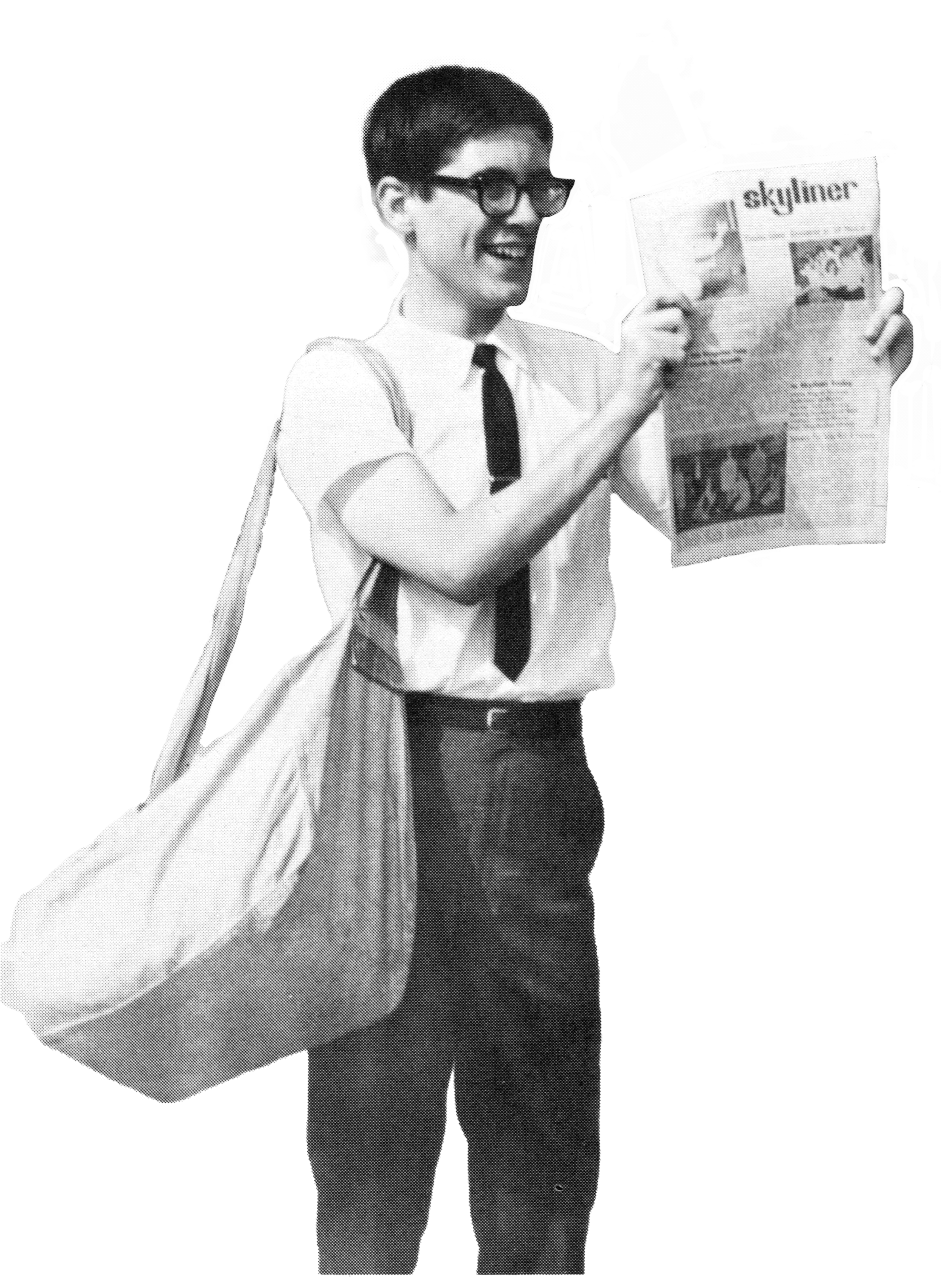
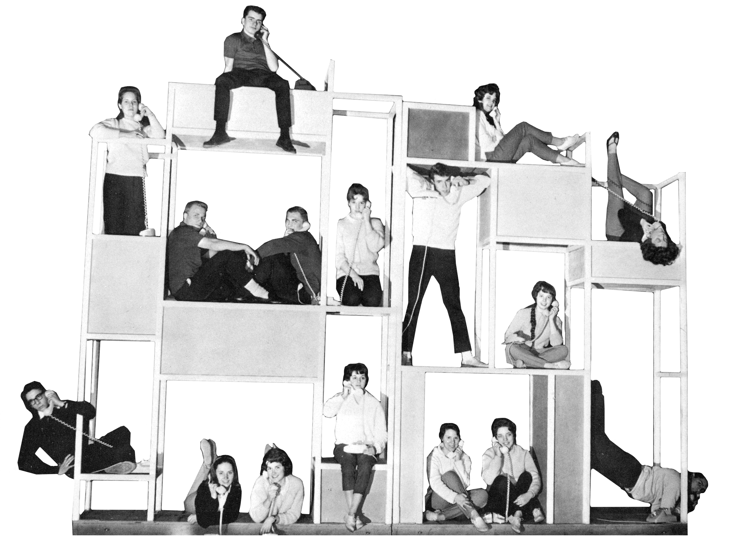
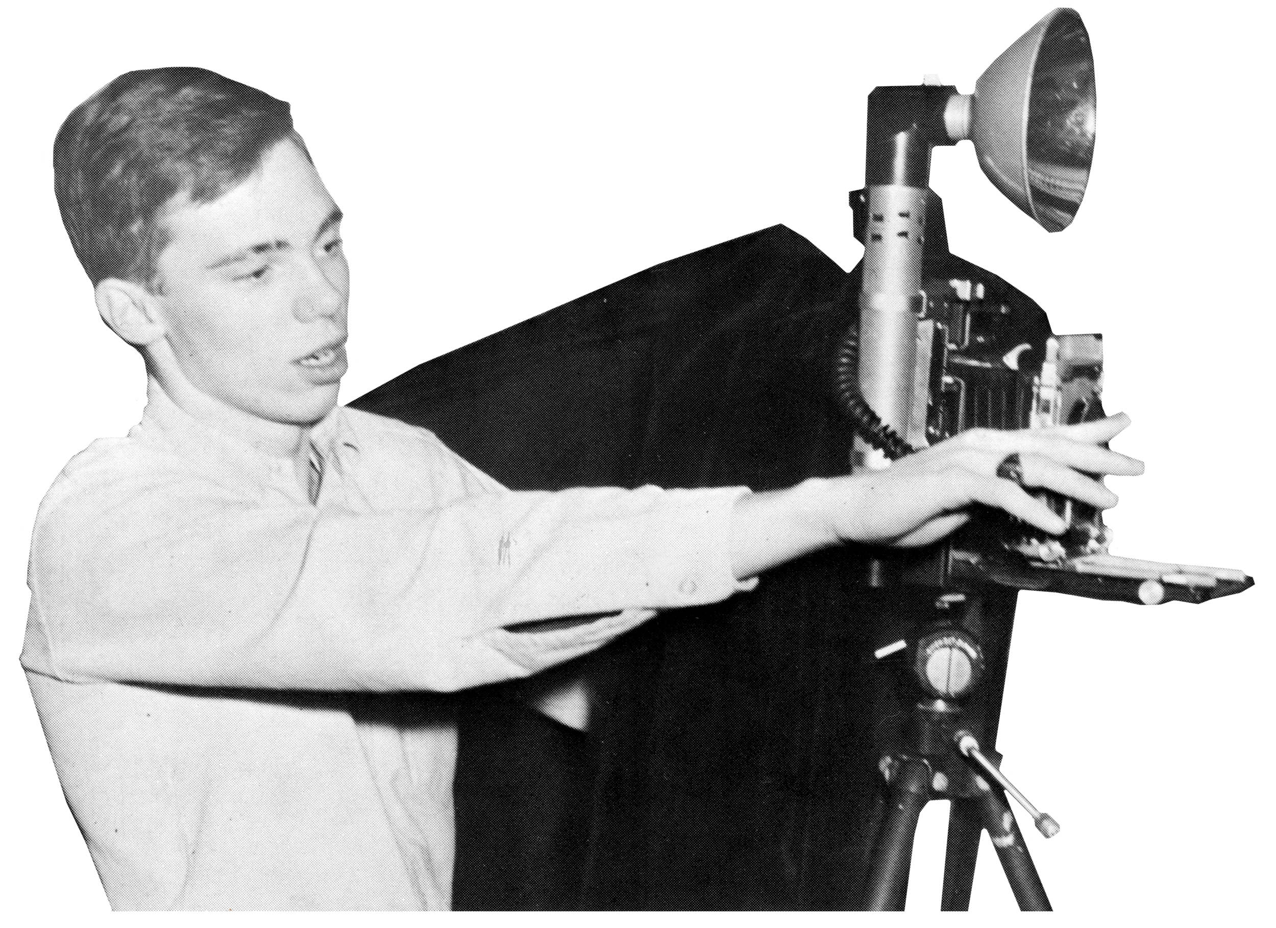
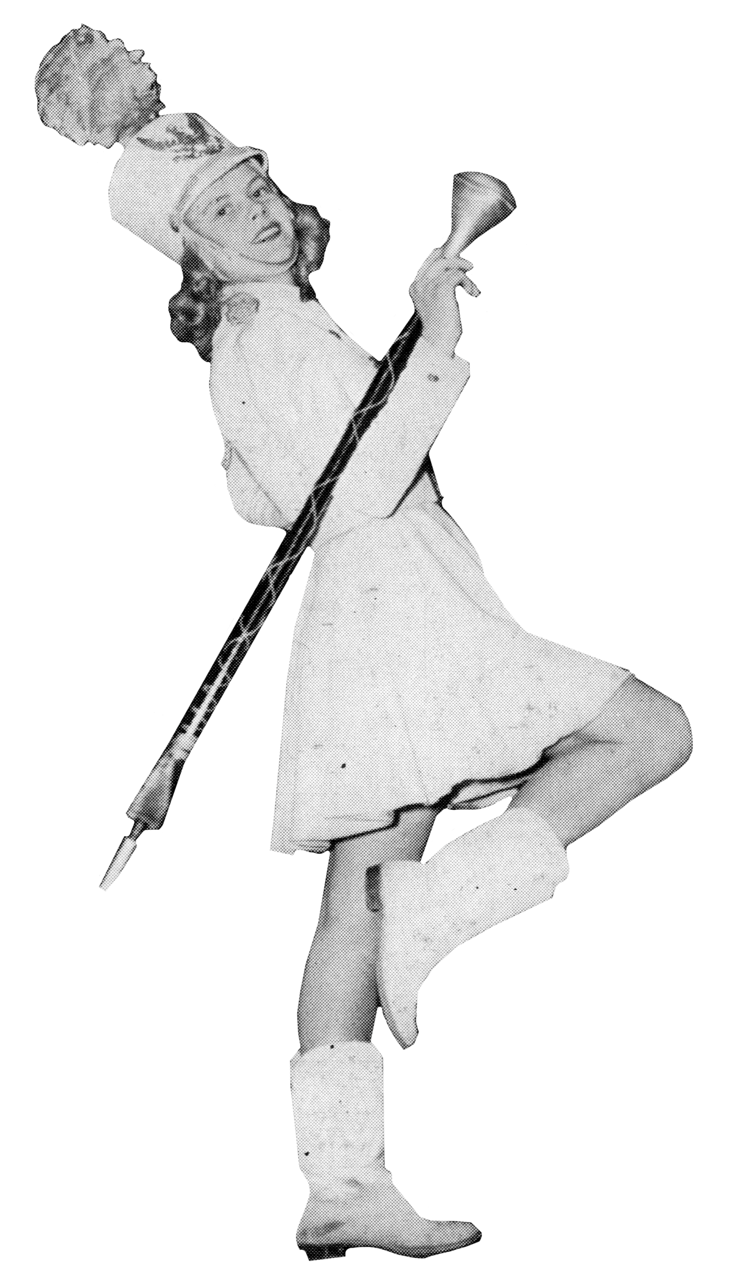
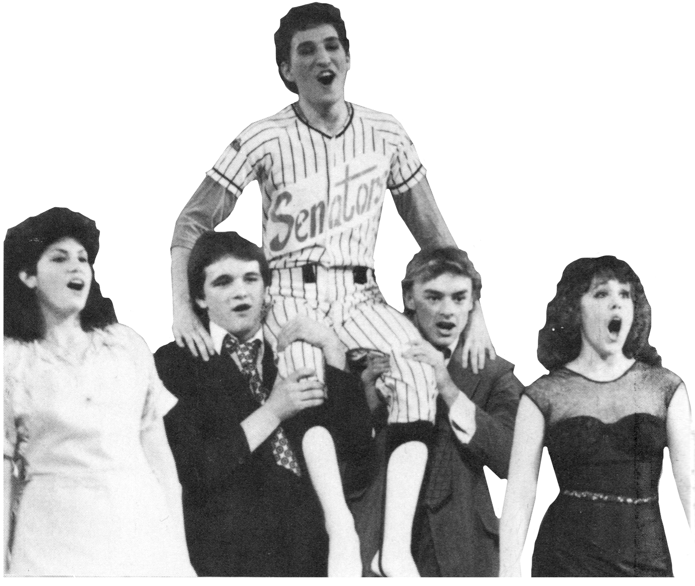
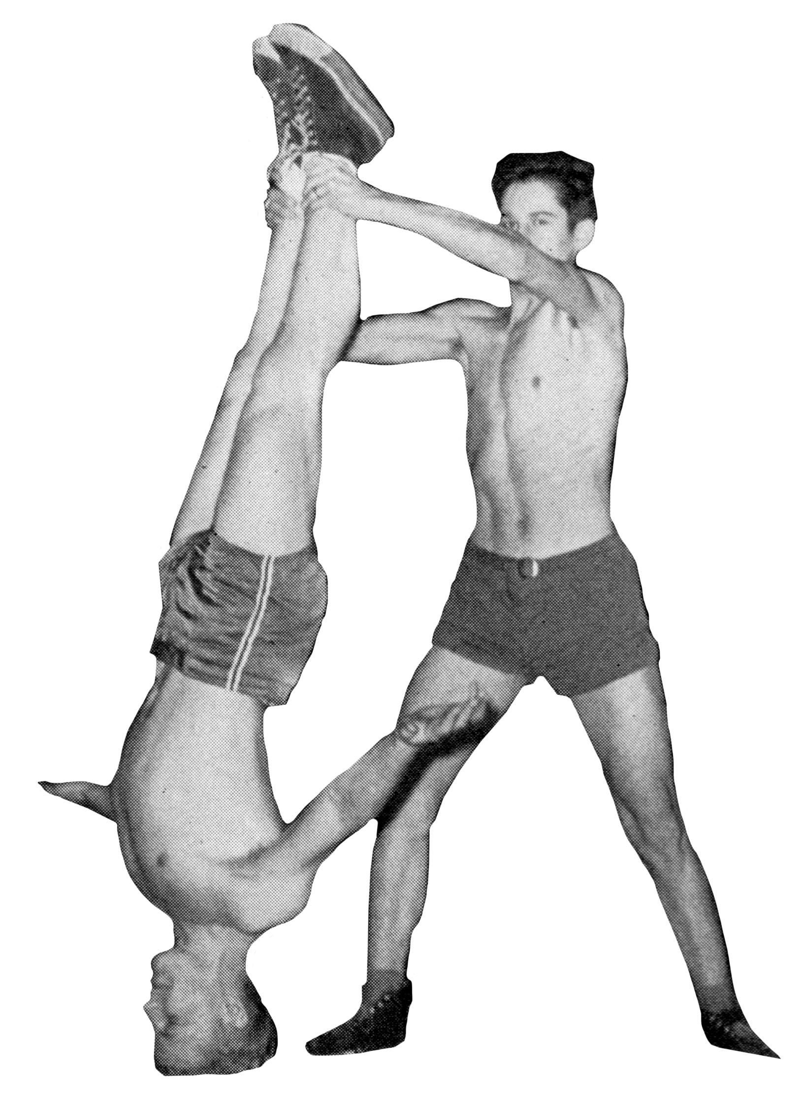
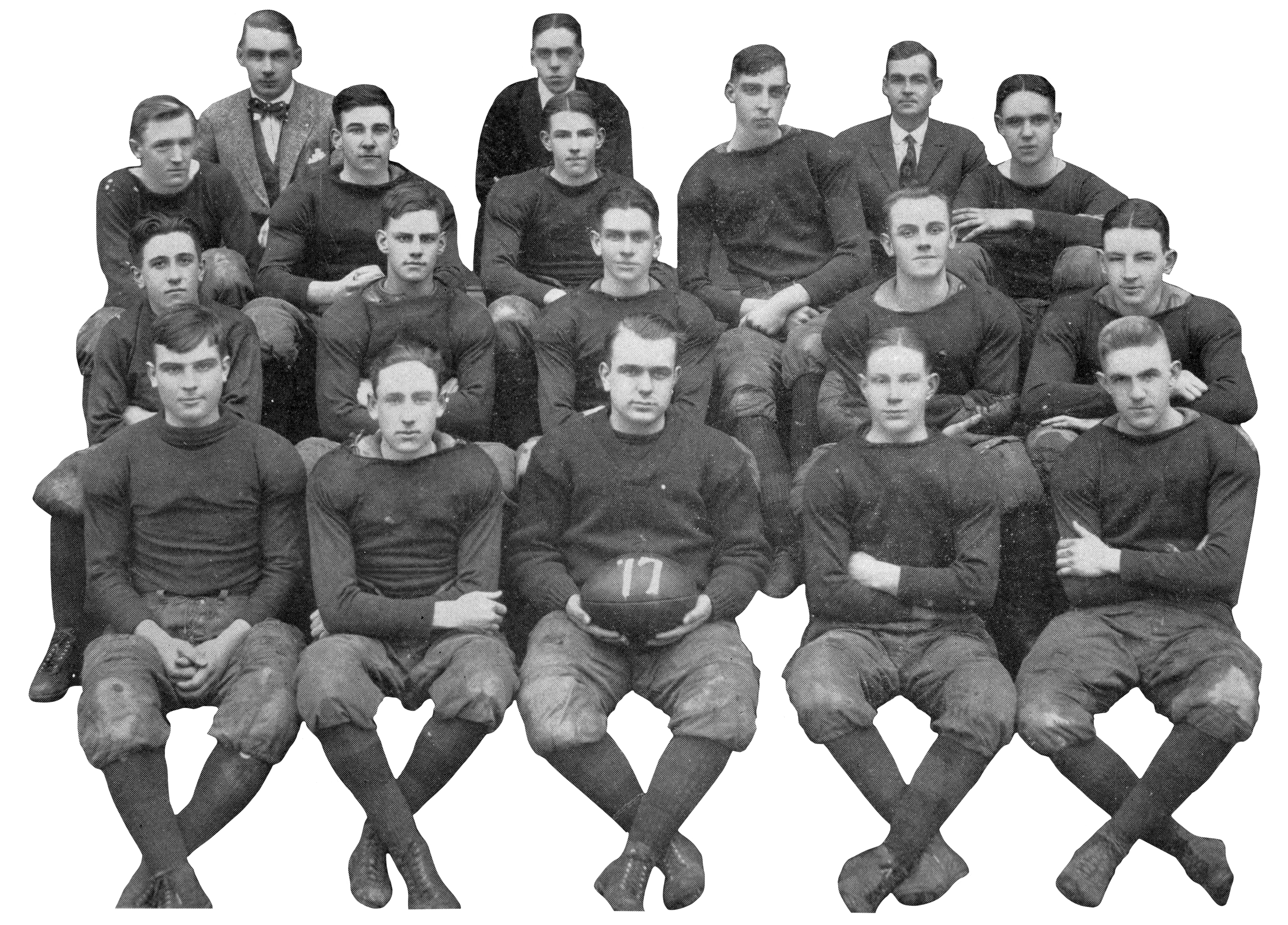
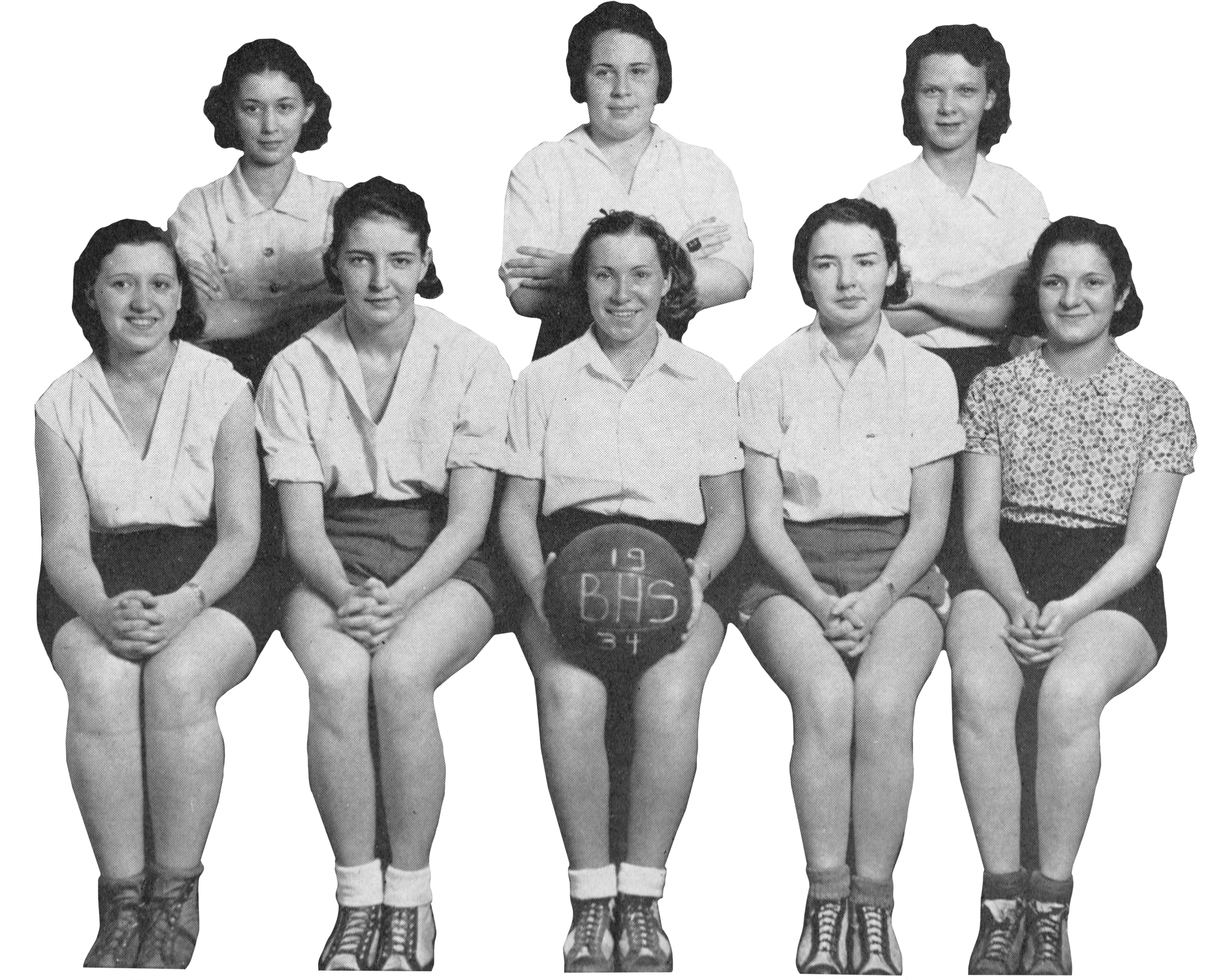
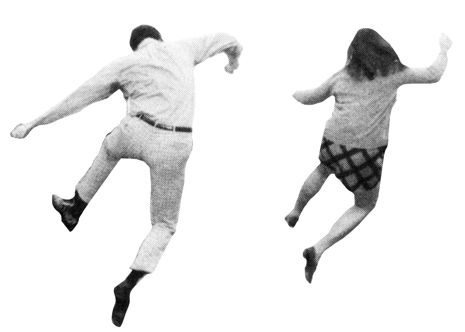
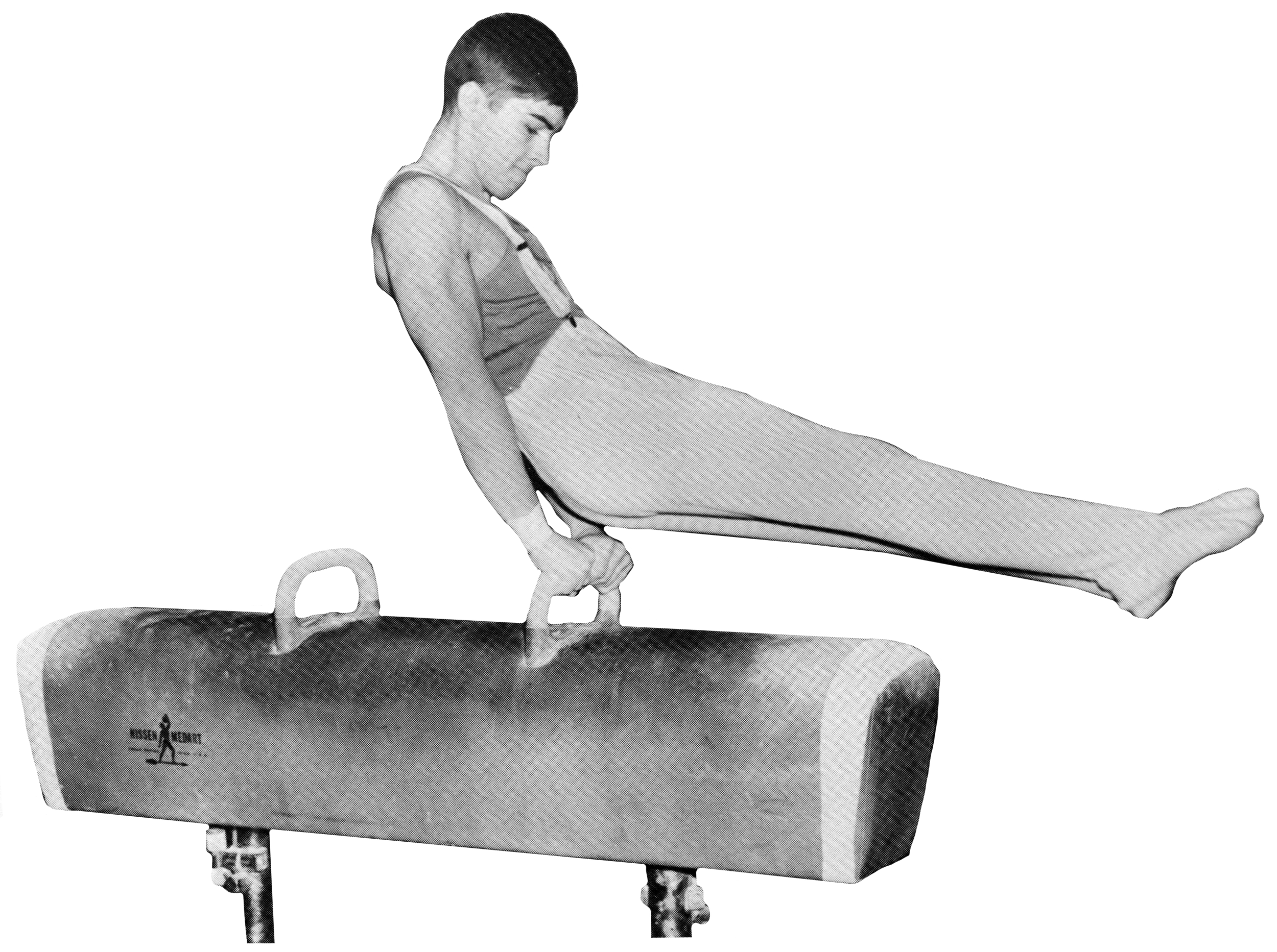
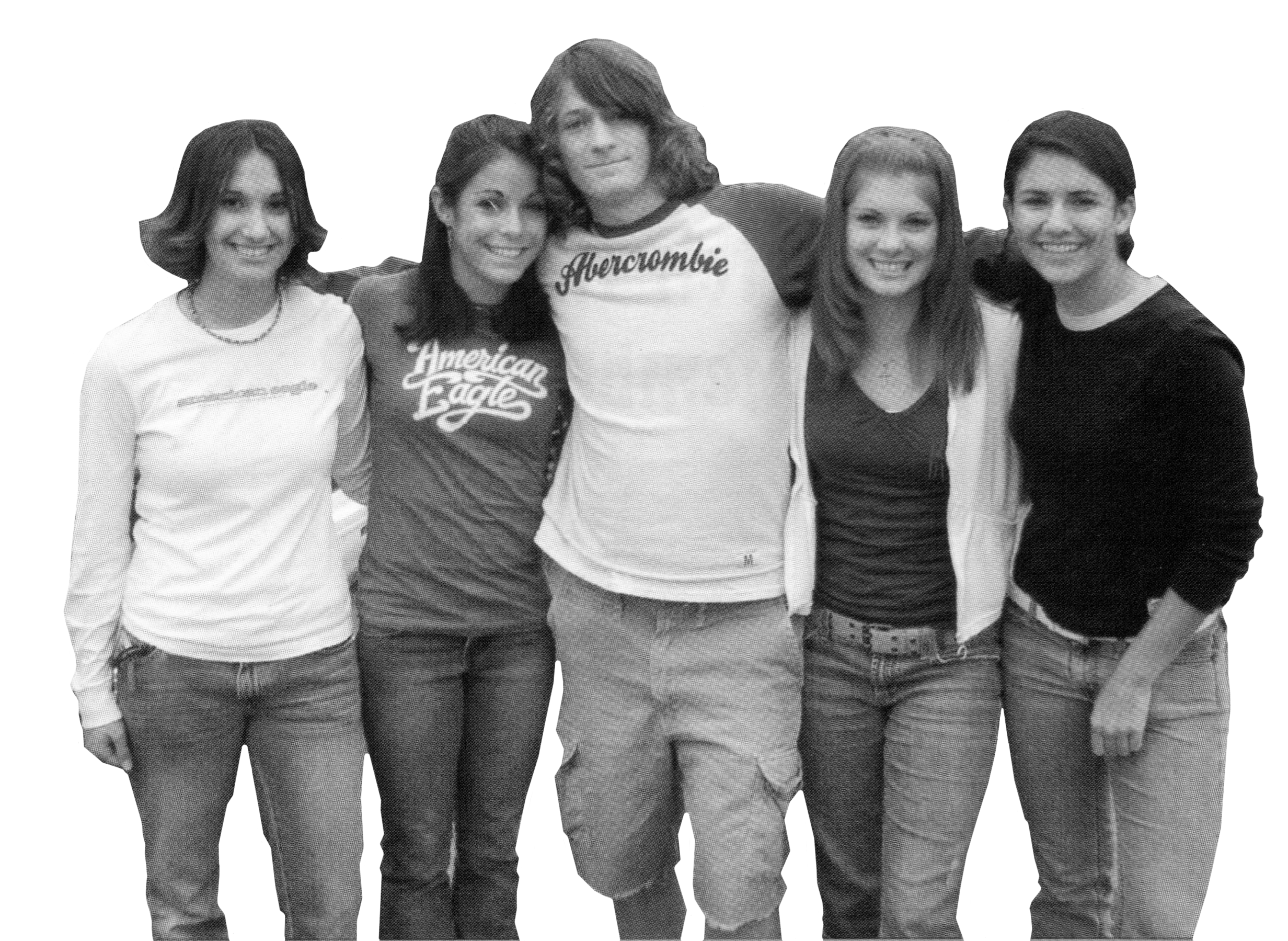
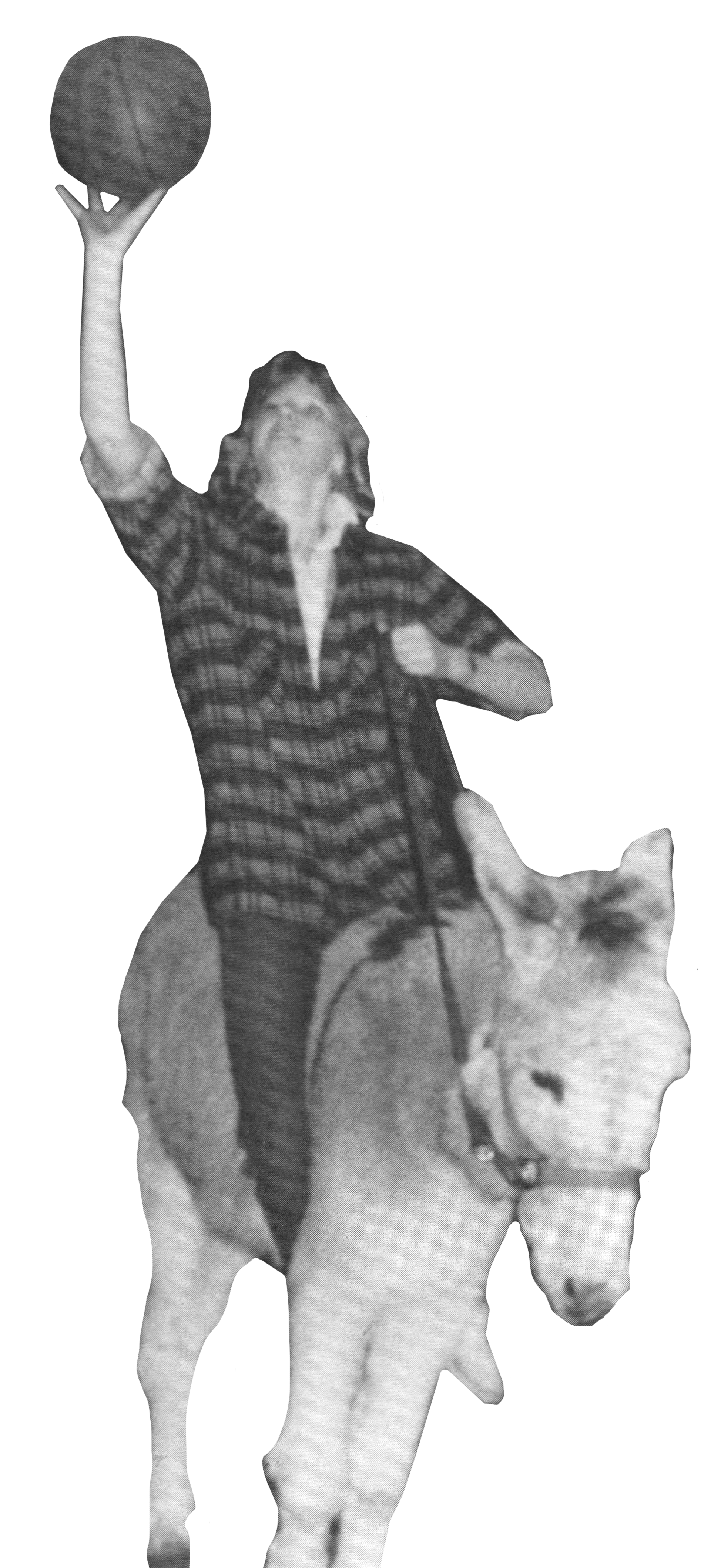
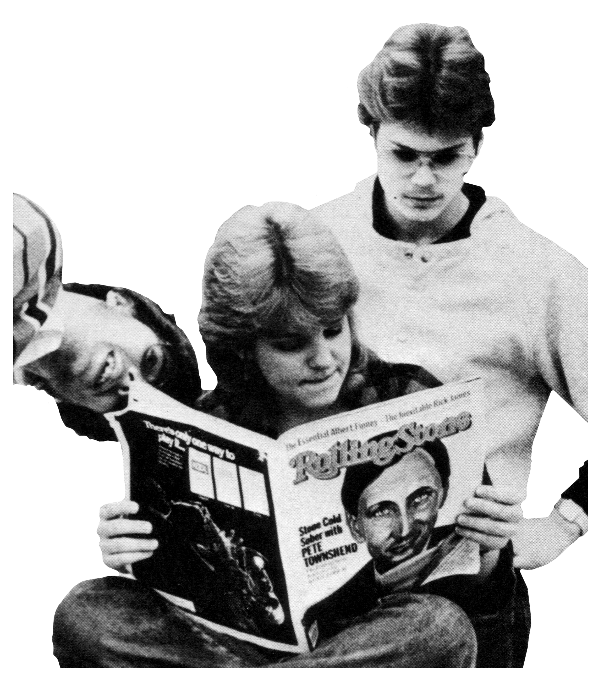
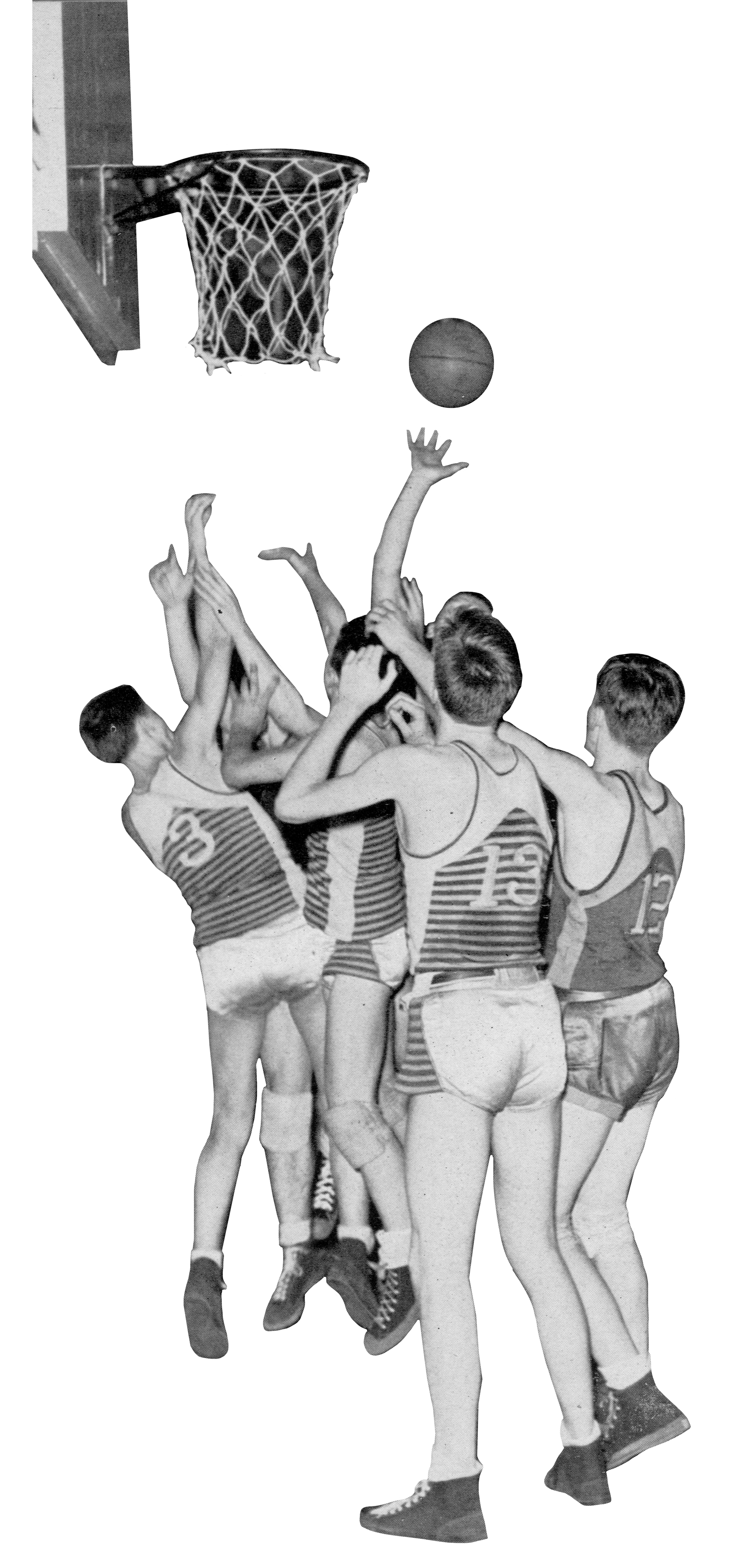
I made the artistic decision to present all the photos on the history wall in black and white. This approach created a cohesive visual tone, ensuring that an image from 1930 wouldn’t feel drastically different from one taken in 2021. I carefully reviewed the scanned images, selecting those with compelling subject matter or era-defining characteristics. From there, I began the meticulous process of removing each background.


Final Panel Designs
Using the school’s bold brand colors, a varsity-style slab serif font, and the final image cutouts, I assembled each panel design like a puzzle, nestling elements together to create a balanced, yet uncluttered composition. Colorful linework added emphasis, texture, and visual flow across each panel.


Installation
I coordinated with a local print vendor to install the wall panel designs, which were printed on UV fade-resistant vinyl and seamlessly installed in a single day.